JAS
← All projects

UI design / Client project / 2023

BeliDomain

Modernising a domain-service platform without rebuilding its structure.

Year
2023
My contribution
UI/UX design intern
Context
Mahakarya Adi Indonesia (MAI) · Client: belidomain.co.id
Focus
Visual direction, interface refinement & high-fidelity design
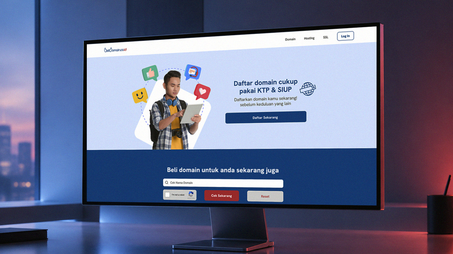
BeliDomain landing-page redesign displayed on a desktop monitor.

A visual refresh with the structure already decided.

During my 2023 UI/UX design internship at Mahakarya Adi Indonesia, I worked on a website refresh for BeliDomain, an Indonesian domain-service company.

The client wanted a more current and coherent interface, but the existing grid, page layouts, content fields, and overall information structure needed to remain largely unchanged. This ruled out a ground-up redesign. The task was to improve how the product looked and read while preserving how its information was already organised.

Constraint

Preserve the existing structure and content placement.

Opportunity

Improve hierarchy, readability, consistency, and perceived quality through the visual layer.

Improve clarity through the visual system.

Because the page architecture was fixed, I focused on the elements that could change: typography, spacing, colour application, component treatment, and the relationship between primary and secondary information.

I developed a cleaner visual direction that could be applied across both the public-facing website and denser account-management pages. The aim was to help users recognise important actions and information more quickly while keeping the interface familiar and compatible with the client’s required layouts.

Clear hierarchy

Distinguish page titles, section labels, data, and supporting text.

Consistent spacing

Create predictable relationships between containers, fields, and actions.

Reusable interface rules

Align buttons, inputs, cards, tabs, and tables across different pages.

Controlled emphasis

Use colour and contrast to guide attention towards active states and primary actions.

Consistency had to do the work that restructuring could not.

Landing detail — title, supporting text, and primary action.Full size ↗

Detail from the full interface.

Public-facing hierarchy
  1. Decision 01

    Build hierarchy without moving the content.

    I used type size, weight, spacing, and container contrast to distinguish major tasks from supporting information. The intended effect was improved scanability while leaving the client’s content sequence intact.

Login detail — repeated form and action treatments.Full size ↗

Detail from the full interface.

Account controls
  1. Decision 02

    Unify repeated controls and states.

    Buttons, inputs, tabs, cards, and table actions were given a more consistent treatment so users could recognise the same interaction patterns across landing, registration, login, and management screens.

Management detail — consistent controls at a higher information density.Full size ↗

Detail from the full interface.

Different levels of density
  1. Decision 03

    Adapt one visual language to different levels of density.

    The public-facing pages needed to feel accessible and promotional, while account pages contained forms, navigation, status information, and tables. I applied the same visual rules across both contexts without forcing them into identical compositions.

  2. Decision 04

    Use emphasis selectively.

    The brand’s blue became a functional accent for primary actions, selected states, and important controls. Neutral surfaces and spacing kept dense account screens from becoming visually heavy.

A coherent refresh within a fixed foundation.

The project produced high-fidelity interface designs covering the public-facing experience and account-management pages. The proposed direction retained the client’s required layouts and content while creating a more consistent hierarchy, component language, and use of space.

My contribution focused on UI/UX design during the internship: interpreting the brief, developing the visual direction, refining interface patterns, and applying them across the supplied page structures.

What this project taught me

Constraints do not remove the need for design judgement; they change where that judgement is applied. When information architecture and layout cannot move, typography, rhythm, component behaviour, and emphasis become the main tools for improving the experience.

If continued

I would validate the refreshed hierarchy with users performing core tasks such as searching for a domain, registering an account, and managing or renewing an existing domain. I would also confirm the component rules with developers before extending the direction across the complete platform.